Colour, graphics and typography are visual building blocks of media products. The palette you pick,
the images you choose and the typefaces you use all send messages to the audience before they read a single word.
What Are Colour, Graphics and Typography?
In R093 you must explain how colour, graphics (images, logos, icons)
and typography (font choices and text layout) are used to:
Match the brand identity of a product or organisation.
Appeal to a specific target audience.
Support the purpose of the product (persuade, inform, entertain, educate).
Keep content clear, readable and accessible.
Key Things to Remember
Colour has meaning and can create mood or show genre.
Graphics must be suitable quality, style and format for the platform.
Typography affects how easy text is to read and how professional it looks.
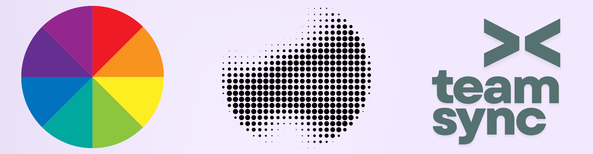
Colour, Graphics & Typography at a Glance
This infographic summarises how visual choices support branding, readability and audience appeal.
Colour & Graphics
How colour palettes and imagery communicate brand and mood.
Brand colours: consistent palette to match logos and existing materials.
Colour meanings: warm colours for energy, cool colours for calm or technology.
Contrast: strong contrast between text and background for readability and accessibility.
Graphics: photos, illustrations, icons and logos chosen to suit the target audience.
Style consistency: using a similar look across all pages, screens and assets.
Exam link: when evaluating designs, comment on how colour and imagery support purpose and audience.
Palette · Imagery · Brand
Typography & Layout
How font choices and text layout affect clarity and tone.
Font choice: sans serif for modern, clean designs; serif for formal or traditional products.
Hierarchy: headings, subheadings and body text clearly separated by size and weight.
Alignment & spacing: consistent alignment and line spacing to aid readability.
Readability: avoid tiny text, overcrowded layouts and long unbroken paragraphs.
Accessibility: avoid colour-only cues and use clear, legible typefaces.
Exam tip: use phrases like "This is effective because the typography makes…" followed by impact on audience.
Fonts · Layout · Clarity
Colour – Mood, Meaning and Contrast
Colour is one of the fastest ways to communicate meaning. It is also vital for accessibility
– poor contrast can make text difficult or impossible to read.
Use high contrast between text and background (e.g. dark text on light background).
Avoid clashing colours that make text vibrate or strain the eyes.
Remember colour blindness – don't rely only on red/green to show differences.
Colour and Branding
Brands usually have a fixed palette (primary and secondary colours).
Consistent colour use across website, app, packaging and social media builds recognition.
Use colours that fit the audience – e.g. bright and playful vs muted and professional.
Graphics – Images, Logos and Icons
Graphics include photos, illustrations, logos,
icons and diagrams. They must be appropriate for the product,
audience and purpose.
Types of Graphics
Photographs – realistic, can show real people, places and products.
Illustrations – stylised, good for younger audiences or explainer content.
Logos – simple visuals representing a brand or organisation.
Icons – small, simple graphics used in interfaces and infographics.
Technical Considerations
Resolution – high enough to avoid pixelation at the final size.
File format – e.g. PNG for transparency, JPEG for photos, SVG for scalable icons.
Compression – balance quality with file size for web and mobile.
Choosing Suitable Graphics
Match the tone of the product (serious, playful, formal, informal).
Ensure representation is inclusive and appropriate (age, culture, diversity).
Make sure images support the message – not just random decoration.
Typography – Fonts and Layout
Typography covers the choice of typeface (font) and how text is laid out on the page
or screen. Good typography makes content easy to read and suits the brand image.
Font Types
Serif (with small strokes, e.g. Times New Roman)
Effect: traditional, formal, often used for print or serious content.
Sans serif (no strokes, e.g. Arial, Helvetica)
Effect: modern, clean, common for digital content and headings.
Display / decorative Effect: eye-catching for logos or headings but usually not suitable for body text.
Readability and Hierarchy
Use a clear hierarchy – different sizes and weights for titles, subheadings and body text.
Keep line length and spacing comfortable so paragraphs are easy to read.
Avoid using too many different fonts on one product – two or three is usually enough.
Typography and Audience
Younger audiences may prefer bold, playful typefaces with strong headings.
Professional or formal audiences expect clean, simple and consistent typography.
Font choices must always support accessibility – avoid tiny or overly decorative body text.
These games help you apply your knowledge of colour, images and type when evaluating media products
and planning your own designs.
Product design
Colour Critic
Analyse design examples (logos, posters, magazines and adverts) and choose
the best option based on colour meaning, branding, contrast and typography.
MCQsColourTypography
Product design
Audience Matcher
Match designs to the right target audience using age, lifestyle, interests and design choices
such as colour palettes, imagery and fonts.
MCQsSegmentationTargeting
Product design
Media Codes Challenge
Identify colour, graphics and written codes in media examples and explain how they create
meaning, impact and engagement for the audience.
ExplainCodes & conventionsVisual design
Mixed exam
Explain It! 2-Mark Engine
Practise clear 2-mark explanations about why a particular colour scheme, image choice
or font is suitable for a given audience and purpose.
2 markersPEE structureDesign decisions
Exam Practice – Colour, Graphics and Typography (AI Marker)
Write your answers in the boxes below, then click Build & Copy AI Marking Prompt. Choose an AI tool and paste the prompt to get examiner-style marking and feedback.
Q1. State one reason why a designer might use a sans serif font for body text on a website. (1 mark)
Technique: Give a simple, clear reason linked to readability on screens.
Q2. Explain one way a colour scheme can help a brand appeal to a teenage audience. (2 marks)
Technique: Make one clear point about the colour choice and then explain the
effect on the audience.
Example structure: "The designer uses… This appeals to teenagers because…"
Q3. Describe how images and typography could be combined on a poster to promote an eco-friendly product. (3 marks)
Technique: Mention at least one image choice, one font choice and explain how they
together support the eco-friendly message.
Q4. Explain two ways that poor colour and font choices could make a leaflet harder to read. (4 marks)
Technique: For each way, describe the problem (e.g. low contrast, decorative font)
and explain how it affects readability or accessibility.
Q5. A charity is producing a new campaign website and social media graphics aimed at young adults.
Discuss how colour, graphics and typography should be used to create a strong, consistent brand that
is engaging and easy to read. Provide justified recommendations. (9 marks)
Technique: Organise your answer into paragraphs for colour, graphics and typography.
For each, explain specific, suitable choices and how they support the charity's message and audience.
Finish with a clear conclusion recommending the best combination.
Paragraph 1: Colour – palette, contrast and mood linked to the cause.
Paragraph 2: Graphics – photos or illustrations, style and representation.
Paragraph 3: Typography – font pairings, hierarchy and readability.
Final paragraph: Conclusion – justify which mix will work best and why.
Level 2 → Level 3 Boost (Q5)
As you type, this will spot what's missing for top-band answers.
Start typing your answer to see tailored targets.
Open an AI tool:
Can You Now…?
Explain how colour choices affect mood, meaning and branding.
Identify suitable graphics for different audiences and purposes.
Choose typography that is readable and matches the product's tone.
Use colour, graphics and typography examples in exam answers with clear explanation and justification.